
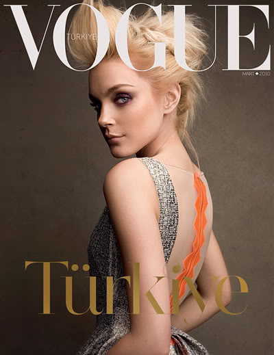
Magazine: Vogue Turkey
Published: March 2010
Cover Model: Jessica Stam
Photographer: Patrick Demarchelier
Website: www.voguemag.com.tr
London-based design agency, Foxall Associates, was chosen by Conde Nast to art direct their new title, Vogue Türkiye now on your newsstands with 562 pages and Jessica Stam on the cover. Based in Europe's largest city Istanbul the latest fashion bible on the scene will be published 12 times a year. For more image previews and few more words from Foxall Associates continue after the jump:


Capturing the mood of modern Turkey, Foxall Associates worked with Conde Nast and local publishers Dogus Group, to create a magazine that reflects the heritage of the region and the underlying culture it has nurtured, as well as accurately projecting this culturally and economically booming country.


"The cover was literally one of the last things we tackled. We wanted to see how the content and design took shape before we wrapped up the pages with the cover. Seda Domanic (the Editor in Chief) put huge faith in Iain and I while we kept brushing aside her concerns for the late cover development. It was as though we needed the adrenaline of a deadline to make an impacting cover, so the later we left it the better the cover would be.
We see the cover as a kind of transition from the Conde Nast cradle into Turkey's own independent Vogue. Patrick Demarchelier is synonymous with the Vogue image and we saw him as being perfect to set the sail. And with Jessica's punchy features and her huge popularity in Turkey we knew it would give the right impact. In the chosen shot she emanates a confidence and aloofness that is shared with our vision of the Vogue Türkiye woman.
It was a unanimous decision not to crowd the cover with cover lines. It makes a break from our competitors and is much more of a confident statement and a bit of a risk at the same time – which, after all, is what Vogue is all about.”

The design was the result of six months of research and development. It's been a great experience working between Conde Nast in London and the Vogue office in Istanbul, and we’re all very happy with the first issue. It sets out everything that we wanted to do: Maintain the architype of Vogue, whilst creating our own confident local edition that competes and compliments the magazine’s family look around the world. The creative industry is not that deeply rooted in Istanbul so it has been hard for Turkey to visualise herself. The typical arabesque swirls or motifs are what stops Turkey having its own modern visual identity, so they were out from the beginning.
However, the Mediterranean influence is everywhere: It's a very positive culture, and so we wanted the content to jump off the pages in a celebratory manner. Way back in the beginning, Iain said that he wanted someone in Brazil to be able to read the magazine and have a feeling of contemporary life and style in Turkey. Iain split his time between Foxall Associates' main studio in east London and Vogue's Istanbul office. Working partly from London helped give a perspective on the design: We were primarily designing for the Turkish public, of course, but we also wanted the magazine's design to make sense globally. We think we've succeeded where the magazine definitely has a Turkish feel to it, but is not pushed to the point of becoming decorative – it retains a seriousness, which is essential.
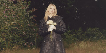
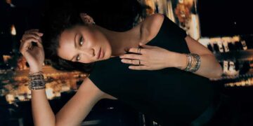
The photography also reflects the same boldness. We commission a mix of new blood and old hats, from Turkey and around the world.”


"The cover was literally one of the last things we tackled. We wanted to see how the content and design took shape before we wrapped up the pages with the cover. Seda Domanic (the Editor in Chief) put huge faith in Iain and I while we kept brushing aside her concerns for the late cover development. It was as though we needed the adrenaline of a deadline to make an impacting cover, so the later we left it the better the cover would be.
We see the cover as a kind of transition from the Conde Nast cradle into Turkey's own independent Vogue. Patrick Demarchelier is synonymous with the Vogue image and we saw him as being perfect to set the sail. And with Jessica's punchy features and her huge popularity in Turkey we knew it would give the right impact. In the chosen shot she emanates a confidence and aloofness that is shared with our vision of the Vogue Türkiye woman.
It was a unanimous decision not to crowd the cover with cover lines. It makes a break from our competitors and is much more of a confident statement and a bit of a risk at the same time – which, after all, is what Vogue is all about.”

The design was the result of six months of research and development. It's been a great experience working between Conde Nast in London and the Vogue office in Istanbul, and we’re all very happy with the first issue. It sets out everything that we wanted to do: Maintain the architype of Vogue, whilst creating our own confident local edition that competes and compliments the magazine’s family look around the world. The creative industry is not that deeply rooted in Istanbul so it has been hard for Turkey to visualise herself. The typical arabesque swirls or motifs are what stops Turkey having its own modern visual identity, so they were out from the beginning.
However, the Mediterranean influence is everywhere: It's a very positive culture, and so we wanted the content to jump off the pages in a celebratory manner. Way back in the beginning, Iain said that he wanted someone in Brazil to be able to read the magazine and have a feeling of contemporary life and style in Turkey. Iain split his time between Foxall Associates' main studio in east London and Vogue's Istanbul office. Working partly from London helped give a perspective on the design: We were primarily designing for the Turkish public, of course, but we also wanted the magazine's design to make sense globally. We think we've succeeded where the magazine definitely has a Turkish feel to it, but is not pushed to the point of becoming decorative – it retains a seriousness, which is essential.
The photography also reflects the same boldness. We commission a mix of new blood and old hats, from Turkey and around the world.”
*Images courtesy of Foxall Associates



I need to get a copy of this mag! Anyone going to Istanbul?
don't get it… It is worthless…
don't get it… It is worthless…