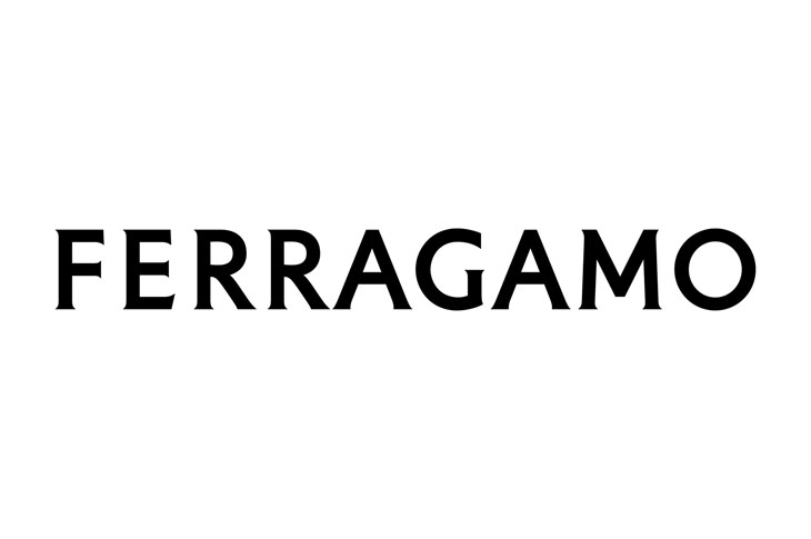
Italian luxury fashion house Salvatore Ferragamo announced that they are rebranding into FERRAGAMO. A new chapter is being written at Ferragamo: a conversation between the classic and the contemporary, based on both heritage and a clear vision of the now. The house appointed renowned graphic designer Peter Saville, a master of unexpected associations and an energetically streamlined style, to create a new logo. Saville conceived a modernist take on a classic font, recalling the classical stone inscriptions that inspired Renaissance artists.
The equity of Florence is in the culture of the company: that led me to the choice of a classic font. The vision is exacting and modern. Thereafter, the font is reduced and becomes modernist. Then there is the craft that is quintessentially Ferragamo, which is condensed in the idea of an inscription set in stone. Within this tension lies the new logotype and the complex balance it expresses. – Peter Saville
History is an immense treasure for a house that owns it. The new Ferragamo logotype contains and expands both history and the now. Far from being just a logo, it is a program, which will frame and direct the new chapter that is about to be written. – Marco Gobbetti.


