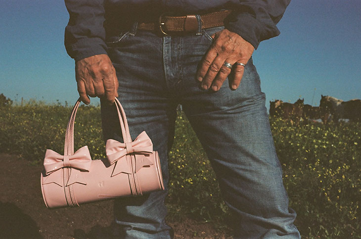
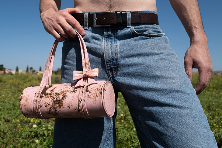
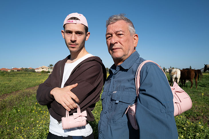
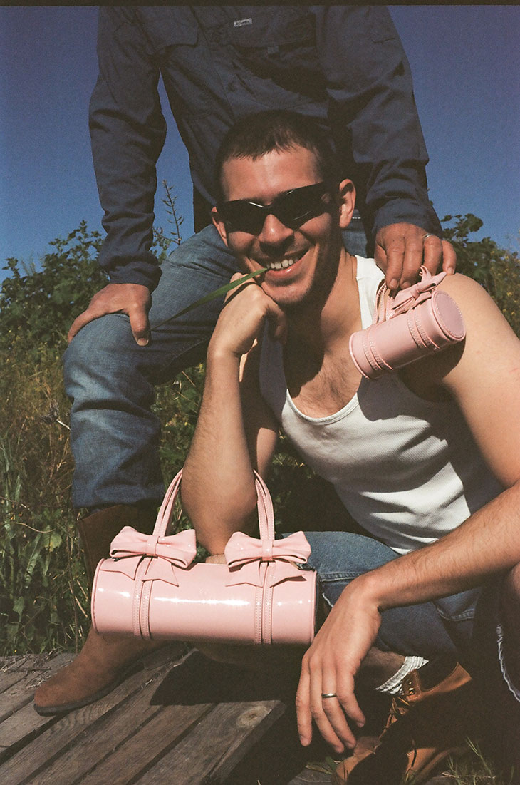
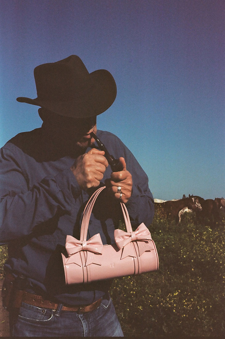
Urban Sophistication, founded by the dynamic sibling duo Elad and Neta Yam, has carved out a niche that resonates with depth, innovation, and a keen sense of the cultural zeitgeist. Their creations define a generation’s aesthetic and spark conversations about the intersection of technology, wellness, and style. Their latest piece, The Crayon Bag ‘Bow Edition,’ launching on March 27th, draws inspiration from the simplicity and joy of childhood crayons. It’s a clever juxtaposition of the delicate coquette style with the rugged essence of the great outdoors, a modern homage to the 1954 Marlboro Man ads, redefining traditional narratives of fashion and identity.
INTERVIEWS
In a conversation with DSCENE Magazine Editor Katarina Doric, Elad and Neta talk about the essence of Urban Sophistication, revealing the underpinnings of their creative journey and the seamless blend of nostalgia, innovation, and social commentary that characterizes their work.
Urban Sophistication is built on the desire to create products that embody emotions and memories. Can you elaborate on how this philosophy influences your creative process? – We think about the products as a vehicle to carry feelings and sentiments that we want to relive over and over again. The best way to describe the creative process is “spontaneous.” Our designs are around a feel we want to capture rather than a season, and the product comes to life when we find a color or tactile element or shape that reflects a feel. We like to think about our creations as “merchandise of life” – something that will always remind you of a time or moment in life that you want to go back to. There is power in a tangible object. Materialism is underrated. We described our earlier work as “merchandise of pop culture,” but when you really think about it, pop culture is a reflection of ourselves (we, all of us, make something popular), so “merch of life” makes more sense.
Starting without formal training in fashion, what were some of the most significant challenges you faced in the industry? – Technical design. For years our team was the two of us and neither our degrees in law and psychology were helpful when you want to explain to a factory how to make the product that seems so simple in your head. You can only imagine what it was like explaining the idea of The Puffer Case to a factory when there was nothing even close to that in the market to reference. Yet there is something very liberating about that ignorance, being able to envision a product without all the technical limits in mind.
There is power in a tangible object. Materialism is underrated.
Your signature iPhone cases have played a big role in defining Urban Sophistication. Is there a unifying theme that connects all Urban Sophistication products? – Aesthetically, the brand has evolved throughout the year. We were 20 and 18 when we started and there was a natural shift in our style, but the conversational nature of the products has remained the same since day one. They all speak with you and for you. With the puffer case for example the two main feedbacks we hear from the USers, is how nice it feels in the hand, and how many questions they get anytime they take their phone out. When you think about it – the phone case is probably the product you wear the most and for years the design of it – making a thin silicone case – was made to flatter the Iphone. We view the case as a communication tool as much as the phone itself and the comforting feel of it is in direct response to the functional and emotional experience of the phone.
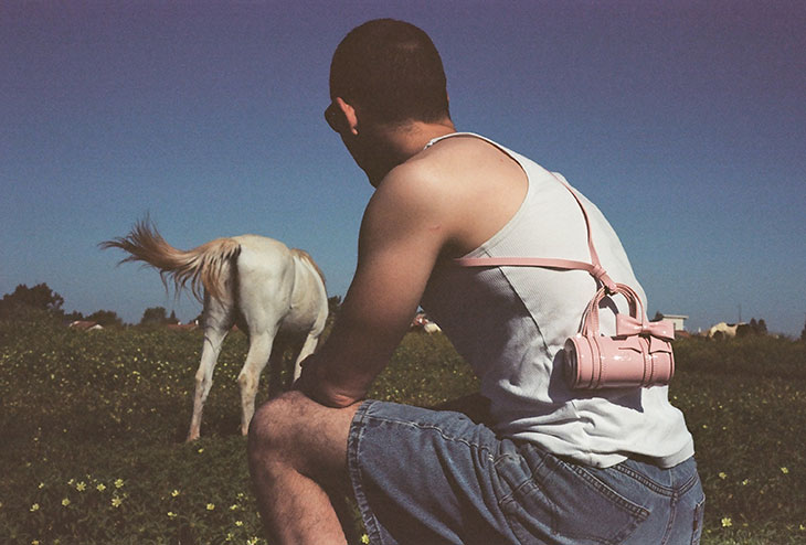
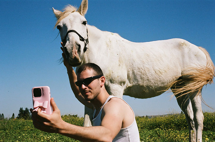
The Crayon Bag ‘Bow Edition’ blends the coquette aesthetic with a nod to the outdoors and western energy. What inspired this unique combination, and how did the idea come to life? – It is the gap between how coquette looks in the feed vs how it sometimes translates trying to embrace the trend in real life – and the result can sometimes feel like…a cowboy with a big fat bow. And yet there is something about the herd behavior that normalizes it even if it at first doesn’t feel natural.
View this post on Instagram
The campaign pays homage to the Marlboro Man ads. What was the thought process behind drawing this parallel? – “The Marlboro Man” was created to change the perception of cigarettes that were at the time considered feminine. “The Marlboro Man” comments on the power of imagery that is shown to you repeatedly to reshape your perception. Bows and coquette in general would’ve felt so random without the algorithm pushing it over and over again everywhere – and the same can be said about the big red boots or any other trend normalized by the feed.
We experiment with all out of curiosity but if it doesn’t feel organic to us we don’t keep up with it.
How do you maintain the authenticity of your brand’s message in the ever-evolving landscape of social media platforms? – We only participate where it makes sense for us. We experiment with all out of curiosity but if it doesn’t feel organic to us we don’t keep up with it.
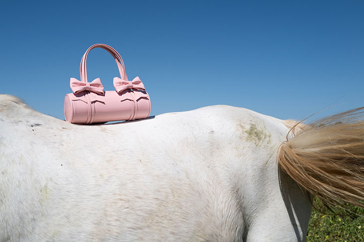
How do you balance creating products that are both trendy and timeless? – There are usually two steps to the process. At first we made a silhouette that we wanted 10 years ago and expect to still want in ten years. The initial process of the design ignores any trends or seasonality. The trendy aspect usually comes only later, through storytelling, we will pick and choose from our library of “patterns” How we present the product or the color we choose for it might change in 6 months from now, but the product itself is created in an incubator.
The noise outside can be very distracting, keep focusing on what you have and create what you love.
How have celebrity endorsements and media coverage influenced the brand’s direction and visibility? – We had a pop up in Tokyo a few months ago, and we got to chat with many of the USers who came and ask them how they first came to know the brand, and some many mentioned Justin Bieber or Kendall Jenner. Their influence and visibility is beyond imagination and we are very grateful to have high profile people engage with the brand’s conversation and enjoy the products. Yet it doesn’t influence the brand’s direction. It is a dangerous zone when you start to design for the feed instead of to the people.
As Urban Sophistication continues to grow, are there new product categories or collaborations you are particularly excited about exploring? – We just launched our clothing line FEEELS earlier this year and are excited to see how the USers engage with it as it keeps rolling out. There is a water bottle that is a game changer. Some unexpected collaborations and our first flagship store that is opening in Tokyo this summer. It is exciting to discover the brand in more mediums and see how it evolves and grows. But there is nothing like meeting our USers face to face at the pop-ups so we made sure to have more of those this year.
What advice would you give to aspiring entrepreneurs in the fashion industry who might be starting from a similar position? – The noise outside can be very distracting, keep focusing on what you have and create what you love.







I absolutely love and indeed fashion houses back design urban. sophistication is a brand to watch