nendo, a name synonymous with innovative and sculptural design, has consistently pushed the boundaries of creativity and functionality. Founded by Oki Sato, nendo is renowned for its unique approach to design, blending Japanese minimalism with a global perspective. Their work spans a multitude of genres, from architecture and interior design to furniture and product design, creating a seamless integration of form and function. Each project reflects a philosophy of subtraction, where simplicity and elegance reveal deeper narratives and emotional connections.
PRE-ORDER IN PRINT and DIGITAL
In this exclusive interview for DSCENE Magazine, Editor Katarina Doric explores the inspirations and experiences that have shaped nendo’s remarkable path. From the transformative trip to the Milan Design Furniture Fair that sparked the creation of the brand, to their philosophy of playful minimalism, Oki Sato shares insights into their design process, collaborative spirit, and future aspirations.

After your trip to the Milan Design Furniture Fair, what specifically inspired you to establish nendo, and how did that experience shape the firm’s early days? – I visited the Salone del Mobile in 2002 with friends because I had just graduated from school and had nothing else to do. At the Salone, I saw architects designing teacups and industrial designers designing spaces. As someone who had studied architecture at university, this borderless and free design activity was a shock to me. I wanted to design freely without being bound by genre. On the last day of the Salone, I decided to form a design office called “nendo” with six people I had traveled with. “Six” does not mean a team of six designers. Two of them had graduated from departments unrelated to design, and another two were still first-year college students. In reality, it was just me and one other person as the designers. Looking back on it now, I am appalled at what a reckless start it was.
The good thing about routine is that repeating the same things every day allows you to sense the smallest changes and differences in daily life. It feels, perhaps, as though one’s resolution has been increased.
“nendo” translates to modeling clay in Japanese, signifying flexibility and adaptability in design. Can you share how this concept is reflected in your approach to various projects? – I think there were roughly two things.The first was that we worked across genres such as architecture, interior design, furniture, product design, and graphics, and sometimes combined them.
In Tokyo at the time, there was a clear segregation of genres, and nendo was seen as a strange and peculiar entity. We were halfway through all the genres, and we were treated as “a firm that does 1/5 of each of the five fields.” But when we started working with a company in Milan, I was very happy when they said, “You are doing five times more than a regular firm,” and I still remember that moment vividly.
The second was the way we approached design. Rather than repeating a methodology just because it worked once, nendo was very conscious of being flexible and doing new processes, concepts, and stories each time.

nendo started with just 5 designers and has grown to a team of 35, working on hundreds of projects simultaneously. What has been key to managing such growth while maintaining the quality and creativity of your work?– I believe that expanding the organization and maintaining the quality of creativity are not contradictory. Rather, I feel that by always making all decisions with the quality of creativity as the top priority, we have created a sense of unity, a sense of direction, and action guidelines that we can follow as an organization.
You’ve described design as the enjoyment of the “boring stuff” and making people happy through it. How does this philosophy guide your project selection and design process? – My daily routine is what relaxes me most. It sounds boring, but this means I don’t have to think about anything in particular. The good thing about routine is that repeating the same things every day allows you to sense the smallest changes and differences in daily life. It feels, perhaps, as though one’s resolution has been increased. I think that this sensation is extremely important for designing.

Collaborations play a significant role at Nendo. How do you choose your collaborators, and what do you think is essential for a successful design collaboration?– I feel that the magic of collaborating with another artist, craftsman, or designer happens when the similarities and differences between the collaborator and nendo are far apart. It’s like they are very different, yet very similar. The similarities become the glue between the two, and the differences allow for a leap in expression. I also think it is important for me personally to always respect my collaborators and be a fan of their work.
I’ve been studying architecture, so until then I had believed that the job of a professional designer was to visualize the end of the project and to simulate and accomplish it. But he taught me that “The moment you feel, ‘This is it,’ is when it’s complete.” – Oki Sato on collaborating with Issey Miyake.
“Break to Make,” your project with Daniel Arsham for Milan Design Week 2023, turns destruction into functionality. Can you discuss its philosophy and how breaking objects to craft new forms challenges traditional design?– Inspired by Daniel’s longstanding theme of “Fictional Archaeology,” the concept involves partially destroying contemporary everyday objects and making them feel as if they were unearthed from the past. We believe that this plays an important role in the collaboration, as it shows that destroying something is not necessarily a negative thing but can also create new value.

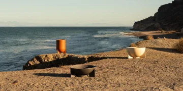
Tell us about your Milan Design Week 2024 project, “nendo: Whispers of Nature.”– The venue of the show was at a large industrial complex transformed by Paola Lenti into a bioecological architectural site with various functions, such as an office, showroom, gallery space, and a restaurant, all arranged around a large central courtyard. The exhibition was held in a small abandoned building within the site, which is set to be converted into a boutique hotel in 2026.
In 2004, we participated in the SaloneSatellite during the design fair, which opened the door for the studio to establish numerous collaborations with European companies. The show, which exhibited furniture pieces inspired by natural principles and phenomena, was called “fur:nature,” deriving from “furniture” and “nature.” Now, 20 years later, the exhibition returned to the theme of nature—a theme at the root of nendo’s design.
We discovered hints in the natural phenomena of everyday life, extracted and developed them into a distinctive aesthetic appreciation of nature specific to Japanese culture. This involves a respect for nature, which we consider essential for coexistence and continued life. The unchanging beauty and power of nature persist even amidst social and environmental change.
The ambiguity of clouds, the relationship of light and shadow, the flow of time perceived underground or in a passing rain, plants soaked in water… The five collections took hints from mundane “whispers of nature” that often get overlooked.

Of the numerous projects nendo has undertaken, do you have a personal favorite? If so, could you describe it and explain what makes it special to you? – The “cabbage chair” from 2008, designed for Issey Miyake. He phoned me one day and told me that lots of paper used when creating his pleated fabrics goes to waste – when they’re pleated, the fabrics are sandwiched between very soft paper. So he asked me if I could make a chair with it. The project was very exciting. I would meet him every week and show him prototypes. One day, I showed him one resembling a chair, made of paper strengthened by resin. I said, “It’s not a chair yet,” but he said, “No, no, it is a chair.”
I’ve been studying architecture, so until then I had believed that the job of a professional designer was to visualize the end of the project and to simulate and accomplish it. But he taught me that “The moment you feel, ‘This is it,’ is when it’s complete.”
That even if it’s only halfway through, it should be solidified the moment you feel some kind of charm, and not forced to reach the goal you envisioned at first.

nendo is known for its sculptural approach to design, regardless of the material. How do you balance form and function in your projects to create pieces that are both artistic and usable?– Functionality is certainly essential to a design, but just like “fun” is a part of the word “function,” I think that including emotional elements such as a sense of familiarity or joy is also a requirement for good design. These emotions create the link between objects and people, people and people, or space and people. Thinkingabout how people react to our designs form our projects.
Functionality is certainly essential to a design, but just like “fun” is a part of the word “function,” I think that including emotional elements such as a sense of familiarity or joy is also a requirement for good design.
In what ways has your Japanese heritage influenced nendo’s design aesthetic, and how do you blend this with global design trends? – We do not always design with global trends in mind. The Japanese design process is about subtraction, which is known as a characteristic of Japanese design. This process aims to highlight stories by removing any non-essential elements to sort information. It is practiced in many areas such as architecture, art, design, and so on.
Some people call this “compression”. They are all related to “minimalism”. However, if this idea gets implemented too extremely, it may generate an expression that carries “coldness” or “stiffness”, the kind of expression that rejects access by human beings, which is a possible risk. So, we add some “playfulness” as “flavour”, which can relax such “coldness” or “stiffness” so that some distance between people can be shortened to make better relationships.

What future goals do you have for nendo? Are there any areas or mediums of design you have yet to explore but wish to? – Recently, we have been working on a gradual increase in architectural projects, and we have been exploring how we can approach these projects from a furniture or industrial design perspective, or how we can design not only the hardware (building or space) of architecture but also the software (service and contents) of the interior in an integrated manner. The Japan Pavilion at the Osaka Kansai Expo, which opens next spring in 2025, is just such a project. Starting with the concept, we are experimenting with total and integrated design, from architecture to the interiors, displays, installations inside, uniforms, and goods. I feel that the realization of this project will help nendo to see what is next for us.
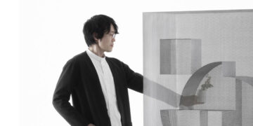
Could you tell us about your DSCENE cover? – For the theme “Line, Form, Space,” we used the ‘single line sketch,’ which is the first step in the design process and plays the most important role, to express the fundamental value elements that compose design: form, function, space, surprise, and innovation. I feel that the future of design will be shaped by these multiple images that connect, branch out and develop in our imagination. I would be happy if I could share these images with readers.
Interview by Katarina Doric – @katarina.djoric
Keep up with nendo on Instagram – @nendo_official


